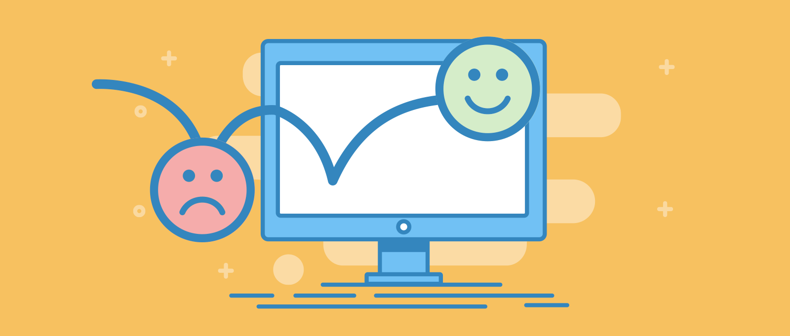
What is Readability and Why is it Important?
Readability is all about how easy it is for people to read and understand the content on your website. When your website is easy to read, visitors are more likely to stay longer, understand your message, and take action, whether that’s buying a product, signing up for a newsletter, or sharing your content. On the other hand, if your website is hard to read, visitors may leave quickly, causing you to lose potential customers.
Readability is crucial for two main reasons:
- User Experience: Visitors should have a pleasant experience when they visit your site. If they struggle to read or understand your content, they’ll probably leave and might not return. Good readability ensures that your message is clear and accessible to everyone, including people with different reading abilities.
- SEO (Search Engine Optimization): Search engines like Google prefer websites with clear, well-structured content. When your website is easy to read, it’s more likely to rank higher in search results, bringing more visitors to your site. Effective use of SEO services can enhance this process by optimizing content, ensuring proper keyword placement, and improving overall site structure, all of which contribute to better visibility and increased traffic.
Now that you understand why readability is important, let’s look at five simple tips to boost readability on your website.
1. Choose Typography Wisely
Typography refers to the style and appearance of the text on your website. The type of font you choose can have a big impact on readability.
- Font Type: Use a clean, simple font that is easy to read. Sans-serif fonts like Arial, Helvetica, and Verdana are popular choices because they are clear and straightforward. Avoid using too many different fonts on one page, as this can make your site look messy and hard to read.
- Font Size: Make sure your text is large enough to be read easily on all devices, including smartphones and tablets. A font size of 16px or larger is generally recommended for body text. You might want to use a larger size for headings to help them stand out.
- Line Spacing: Proper line spacing, also known as leading, helps make text easier to read. If lines of text are too close together, it can be hard for the reader to follow. A good rule of thumb is to set line spacing at 1.5 times the font size.
Example: Imagine visiting a website with tiny, decorative fonts and closely spaced lines. It would be difficult to read, right? Now, picture a site with a clean, simple font, large text, and enough space between lines. You’d likely find it much easier to read and understand the content.
2. Use Shorter Sentences and Easy-to-Understand Words
When writing for the web, clarity is key. People tend to skim rather than read every word, so it’s important to make your content easy to digest.
- Short Sentences: Break down complex ideas into shorter sentences. This makes your content easier to follow and reduces the chances of confusing your readers.
- Simple Language: Avoid using jargon or complicated words. Instead, use plain language that anyone can understand. If you need to use a technical term, be sure to explain it clearly.
Example: Consider the difference between these two sentences:
- “The utilization of cutting-edge technology facilitates the optimization of our workflow processes.”
- “Using new technology helps us work better.”
The second sentence is much easier to read and understand, especially for someone who may not be familiar with the technical terms.
3. Use Heading Tags Strategically
Headings are a great way to organize your content and make it easier to navigate. They help break up your text into sections, allowing readers to quickly find the information they’re looking for.
- Use Multiple Levels of Headings: Use H1 for your main title, H2 for major section titles, and H3 for sub-sections. This creates a clear structure that both readers and search engines can follow.
- Descriptive Headings: Make sure your headings are descriptive and reflect the content of the section they introduce. This helps readers understand what to expect from each part of your article.
Example: If you’re writing a blog post about cooking tips, your headings might look like this:
-
H1: “Essential Cooking Tips for Beginners”
-
H2: “Choosing the Right Ingredients”
-
H3: “Picking Fresh Vegetables”
-
H2: “Cooking Techniques Everyone Should Know”
-
H3: “Mastering the Art of Sautéing”
This structure makes it easy for readers to jump to the section that interests them most.
4. Use Images to Break up Text
Large blocks of text can be overwhelming and hard to read. Breaking up your content with images can make your page more engaging and easier to digest.
- Relevant Images: Use images that are relevant to the content and help illustrate your points. This not only makes your content more interesting but also helps convey your message more effectively.
- Image Captions: Adding captions to your images can provide additional context and make them more useful to your readers.
Example: If you’re writing a blog post about gardening, you could include photos of different plants, garden layouts, or tools. These images would break up the text and give readers a visual reference to the information you’re providing.
5. Leverage Whitespace
Whitespace, also known as negative space, is the empty space around elements on your page. While it might seem counterintuitive, using more whitespace can actually improve readability by making your content feel less cramped.
- Margins and Padding: Increase the space around text and images to give them room to breathe. This makes your content easier to scan and reduces eye strain.
- Avoid Overcrowding: Don’t try to pack too much information onto one page. Use whitespace to separate different sections, making it easier for readers to focus on one thing at a time.
Example: Compare two websites: one with text and images crammed together with little space between them, and another with ample whitespace around each element. The second site would likely feel more organized and easier to read, giving visitors a better overall experience.
Key Takeaway
Improving readability on your website is crucial for keeping visitors engaged and helping them understand your message. By choosing the right typography, using shorter sentences, strategically placing headings, incorporating images, and leveraging whitespace, you can create a website that is not only visually appealing but also easy to read.
Remember, a readable website benefits both your users and your search engine rankings. So, take the time to implement these tips and see how they can improve your site’s performance.
Are you ready to take your website to the next level? Our team at Professional Designers is here to help! We’ll work with you to develop a website that not only looks great but is also easy to read and navigate. Whether you need a fresh design or a complete website redesign, we have the skills and experience to bring your vision to life.
With our focus on readability, your website will be more engaging, making it easier for your visitors to find the information they need. Let us help by providing you web design services in Switzerland that truly stand out and drive results. Get in touch with us today to start your project!
Now that you know how we design top-quality websites for our clients, you can see some of our work in our portfolio.
Contact us today or get a free project estimate. to start your project!